The Psychology of Colour in Law Firm Branding
Colour psychology is the study of how colours affect perceptions and behaviours. In legal branding and marketing, the right colours can convey trust, professionalism, and competence. Colours can evoke emotions and influence how people perceive your brand. For instance, blue is often associated with trust and dependability, making it a popular choice for law firms.
Colour choices can also affect decision-making processes. For example, red can create a sense of urgency, which can be useful for calls to action but might be seen as too aggressive for a law firm's primary colour scheme.
The Meaning of Colours in Legal Branding
Red in Legal Branding
Connotations: Power, Passion, Urgency
Red is often associated with strength and authority. It can convey a sense of confidence and command. It evokes strong emotions and intensity. It's vibrant and energetic, and can reflect a firm’s commitment and zeal. Red is attention-grabbing and can create a sense of immediacy or urgency. It can be effectively used to prompt quick responses or actions.
Examples of Law Firms Using Red in Their Branding
Norton Rose Fulbright
Using red in legal branding should be strategic and sparing. It can effectively highlight important elements, prompt quick actions, and convey a sense of power and urgency. However, due to its intensity, it’s essential to balance red with more neutral colours to maintain a professional and sophisticated appearance.
Blue in Legal Branding
Connotations: Trust, Reliability, Professionalism
Blue is often associated with trustworthiness and dependability. It's a colour that inspires confidence and security, essential qualities for a legal firm. It conveys a sense of reliability and stability, making it an ideal choice for law firms that want to project a dependable image (which is likely all of them). The colour blue is seen as professional and competent. It evokes a sense of calm and order, which is especially important in the legal industry.
Examples of Law Firms Using Blue in Their Branding
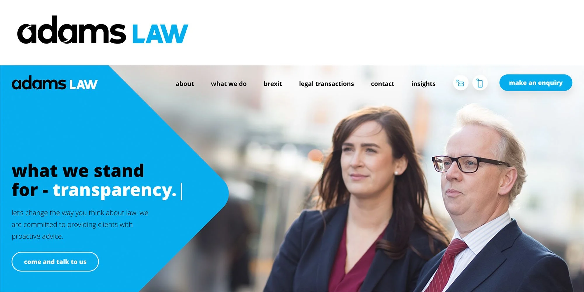
Adams Law
Using blue in legal branding is a strategic choice that can help convey trust, reliability, and professionalism. By integrating blue into logos, websites, and marketing materials, law firms can build a strong, dependable image that appeals to clients seeking trustworthy legal services.
Green in Legal Branding
Connotations: Growth, Stability, Peace
Green is often associated with growth and renewal. It evokes a sense of progress and positive development, making it a suitable colour for law firms that want to project a forward-thinking image. It also conveys stability and reliability, which are essential qualities for any legal practice. It suggests that the firm is grounded and dependable. The colour green has calming and reassuring connotations, which can help clients feel more at ease when engaging with the firm.
Examples of Law Firms Using Blue in Their Branding
A&O Shearman
Using green in legal branding effectively conveys growth, stability, and peace. It is particularly suitable for firms focused on environmental law or sustainability initiatives. Incorporating green into logos, websites, and marketing materials can help law firms stand out as forward-thinking and responsible, appealing to clients who value these attributes.
Yellow in Legal Branding
Connotations: Optimism, Clarity, Warmth
Yellow is often associated with cheerfulness and positivity. It can evoke feelings of happiness and energy, which can help create a welcoming impression. It is also linked to clarity and intellectual stimulation. It can grab attention and make complex information easier to digest. Yellow radiates warmth and friendliness, making it a suitable colour for firms that want to appear approachable and client-friendly.
Examples of Law Firms Using Yellow in Their Branding
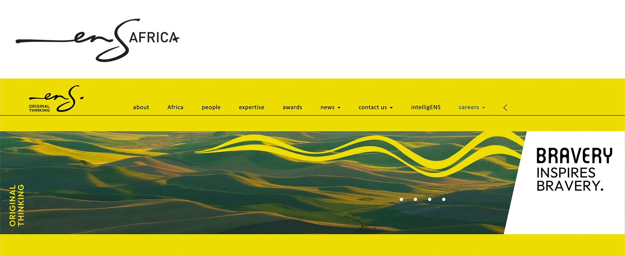
ENS
Using yellow in legal branding can create an optimistic, clear, and warm image. It is particularly effective for drawing attention to important information and creating a welcoming impression. Incorporating yellow into logos, websites, and marketing materials can help law firms stand out and appeal to clients seeking a friendly and approachable legal partner.
Black in Legal Branding
Connotations: Sophistication, Luxury, Elegance
Black is often associated with sophistication and exclusivity. It conveys a sense of authority and seriousness, making it ideal for firms that want to project a high level of professionalism. Black evokes luxury and high quality. It is a colour that premium brands frequently use to denote a elevated status. It is timeless and elegant, suggesting a refined and polished image.
Examples of Law Firms Using Black in Their Branding
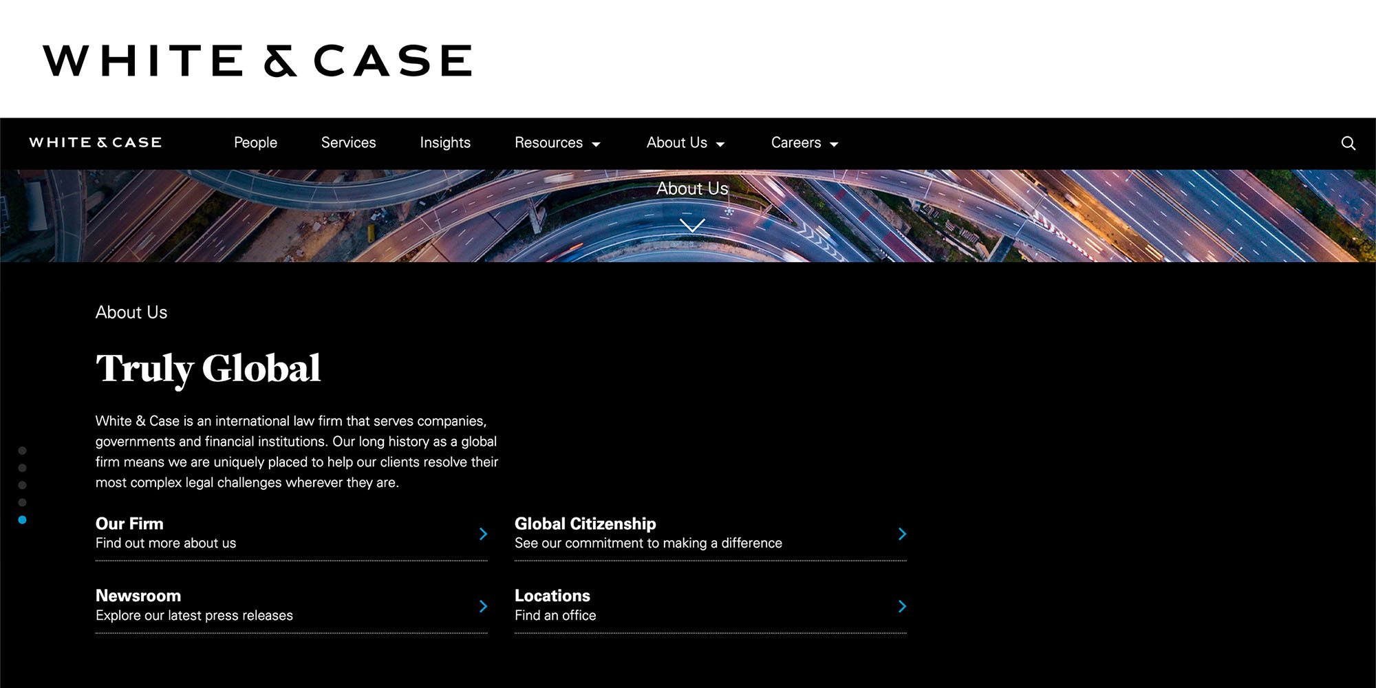
White & Case
Using black in legal branding can effectively convey sophistication, luxury, and elegance. It is particularly suitable for firms that want to project a high level of professionalism and exclusivity. Incorporating black into logos, websites, and marketing materials can help law firms create a strong and memorable impression, appealing to clients seeking top-tier legal services.
Purple in Legal Branding
Connotations: Wisdom, Dignity, Creativity
Purple is often associated with wisdom and knowledge. It conveys a sense of intellectual depth and expertise, which can be appealing for law firms aiming to showcase their legal acumen. The colour purple is also linked to dignity and prestige. It suggests a firm that carries itself with honour and respect, making it ideal for firms that want to project this kind of image. Purple also evokes creativity and innovation, making it suitable for firms that want to be seen as forward-thinking and progressive.
Examples of Law Firms Using Purple in Their Branding
Dentons
Using purple in legal branding can effectively convey wisdom, dignity, and creativity. It is particularly suitable for firms that want to project expertise and innovation. Incorporating purple into logos, websites, and marketing materials can help law firms create a distinctive and sophisticated image, appealing to clients seeking knowledgeable and forward-thinking legal services.
Orange in Legal Branding
Connotations: Energy, Enthusiasm, Confidence
Orange is a vibrant and energetic colour that can convey a sense of dynamism and vitality. It suggests that the firm is active and forward-moving. It is also associated with enthusiasm and excitement. It can make a brand appear more approachable and engaged. Orange exudes confidence and can help a firm project a bold and assertive image.
Examples of Law Firms Using Orange in Their Branding
Eversheds Sutherland
Using orange in legal branding can effectively convey energy, enthusiasm, and confidence. It is particularly suitable for firms that want to project a dynamic and approachable image. Incorporating orange into logos, websites, and marketing materials can help law firms create a lively and engaging brand, appealing to clients seeking energetic and confident legal services.
Pink in Legal Marketing
Connotations: Compassion, Warmth, Innovation
Pink is often associated with warmth and compassion. It can convey a sense of care and empathy, which can be appealing for law firms that emphasise client relationships and support. It can evoke feelings of friendliness and approachability. It can make a firm appear more welcoming and client-focused. Pink can also symbolise creativity and innovation. It is a non-traditional colour for law firms, which can help a firm stand out as modern and forward-thinking.
Examples of Law Firms Using Pink in Their Branding
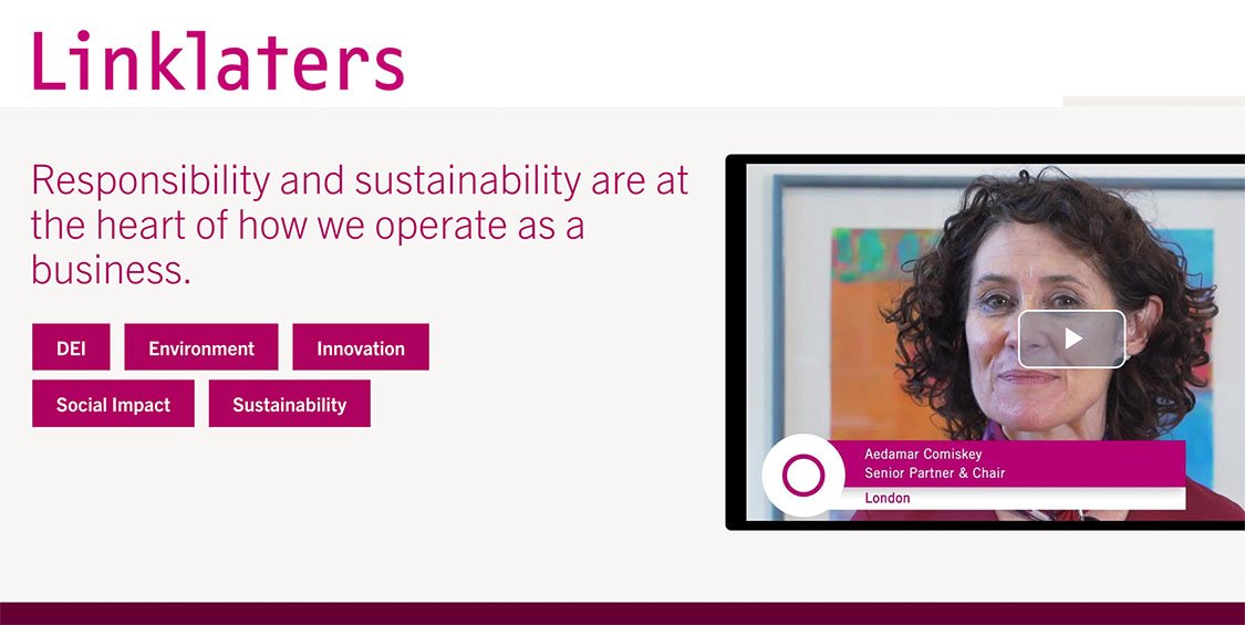
Linklaters
Using pink in legal branding can effectively convey compassion, warmth, and innovation. It is particularly suitable for firms that want to project a client-focused and modern image. Incorporating pink into logos, websites, and marketing materials can help law firms create a distinctive and approachable appearance, appealing to clients seeking a caring and innovative legal partner.
Practical Tips for Implementing Colour Psychology for Law Firms
Implementing colour psychology effectively in your branding strategy involves more than just choosing the right colours. It requires thoughtful application across all marketing materials to create a cohesive and compelling brand experience. Here are some practical tips to help you make the most of colour psychology in your legal branding and marketing efforts.
Ensure Uniformity in Your colour Usage
Brand Guidelines: Develop a comprehensive brand guideline document that outlines your colour palette and provides specific usage instructions. This document should be shared with all team members and external partners to ensure consistency.
Logo and Branding Materials: Use your chosen colours consistently in your logo, business cards, letterheads, and other branding materials. This consistency helps reinforce brand recognition and trust.
Digital Presence: Ensure your website, social media profiles, email newsletters, and online advertisements all reflect your brand colours. Consistency across digital platforms enhances your professional image and makes your firm more memorable.
Create a Harmonious and Visually Appealing Palette
Primary and Secondary Colours: Choose a primary colour that represents your brand’s core values and a few secondary colours that complement the primary colour. This balance helps create a visually appealing and cohesive look.
Accent Colours: Use accent colours sparingly to highlight important information or calls to action. Accent colours should contrast well with your primary and secondary colours to draw attention without overwhelming the viewer.
Neutral Colours: Incorporate neutral colours like white, black, or grey to balance your colour palette and prevent it from becoming too intense. Neutrals can also provide a clean and professional backdrop for your more vibrant brand colours.
Ensure Your Colour Choices Are Inclusive
Contrast Ratios: Use tools like the Web Content Accessibility Guidelines (WCAG) to check the contrast ratios of your colour combinations. High contrast between text and background colours improves readability for all users, including those with visual impairments.
Colour Blindness Considerations: Avoid relying solely on colour to convey important information. Use patterns, textures, or labels in addition to colour to ensure your content is accessible to people with colour blindness.
User Testing: Conduct user testing with individuals who have different types of visual impairments to gather feedback on the accessibility of your colour choices. This feedback can help you make necessary adjustments to improve inclusivity.
Implementing colour psychology in your legal marketing strategy requires careful planning and execution. By maintaining consistency across platforms, balancing your colour palette, and ensuring accessibility, you can create a cohesive and compelling brand experience that resonates with your audience.
Thoughtful application of colour psychology can enhance your firm's professional image, increase engagement, and ultimately attract more clients.


