Legal Community Branding and Concept Development
The Courterie is a global community-driven support network designed exclusively for women in senior and leadership roles in the legal field. We’re not here for surface-level networking; this is a safe haven for real connection, personal growth, and professional empowerment.
The Courterie is where women come to share wisdom, gain strength, and celebrate one another in ways that empower each member to bring her full self into her work and leadership.

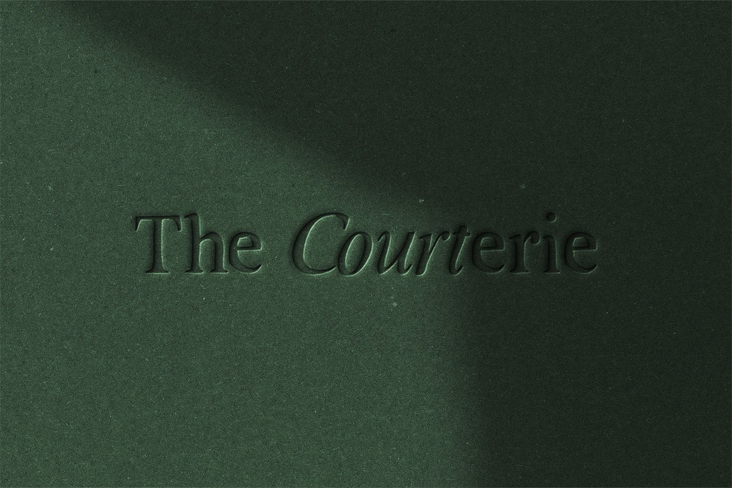
Primary Logo
This typeface has a more contemporary feel than traditional serif fonts, suggesting that The Courterie isn’t an old-school, rigid space but a progressive, inclusive community where members can be both professional and personable.
The logo is refined without any additional symbols or embellishments, letting the typography carry the weight. This simplicity gives it a timeless appeal, ensuring that it will feel relevant and sophisticated for years to come. It feels like a brand that respects tradition but is also adaptable and forward-thinking.

In The Courterie, we uplift each other’s journeys, champion each other’s victories, and face challenges side by side. Together, we are reimagining leadership in law—where collaboration, empathy, and strength in numbers are the true marks of success.
Logo Variations




The Scarlet Ibis
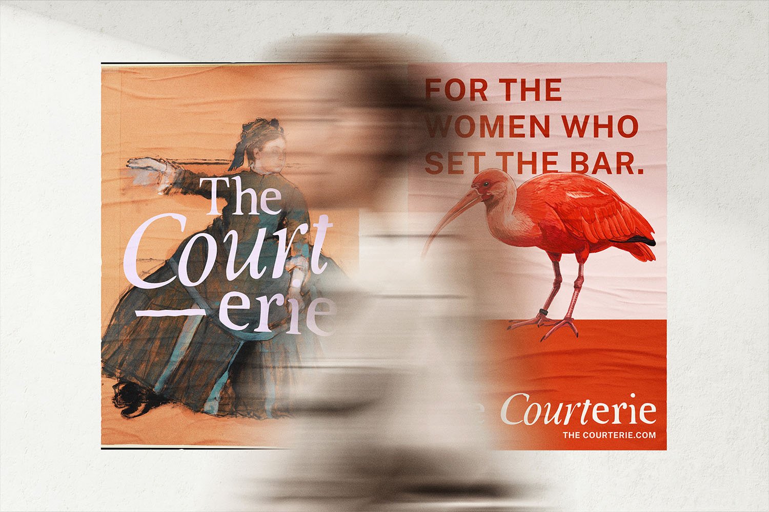
A symbol of strength, beauty, and resilience, the Scarlet Ibis becomes The Courterie’s emblem, showing up in subtle but distinct places. This emblem represents the proud, resilient nature of each member, embodying the community’s strength.

Court [noun]: A body of people presided over by a judge, judges, or magistrate and acting as a tribunal in civil and criminal cases
+
Coterie [noun]: An intimate and often exclusive group of persons with a unifying common interest or purpose
= Courterie
Imagery Style
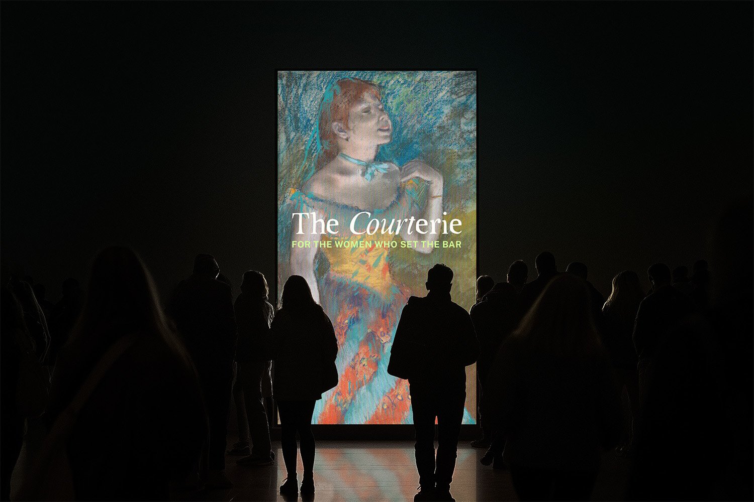
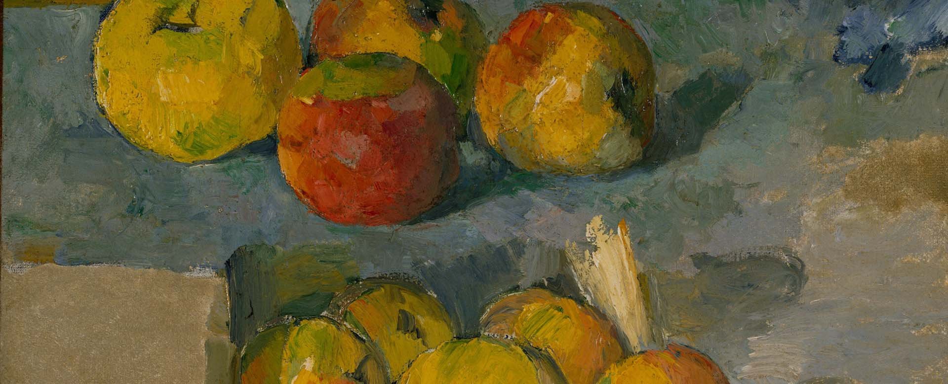
To evoke a timeless, elevated feel, The Courterie’s branding leans on famous artworks of women.
The classical paintings—especially those that depict women in moments of contemplation, elegance, resilience or strength—are used as backgrounds on social media or as accent visuals in materials.
The Courterie Values
Support: The Courterie is here to lift each other up, share wisdom, and navigate challenges together.
Belonging: A space for women in law (in senior or leadership roles) to connect globally and build authentic, supportive relationships
Authenticity: The Courterie is a judgement-free zone where vulnerability meets strength.
Empowerment through Connection: Reinforcing that the journey is easier when it’s shared, and knowledge is collective power.
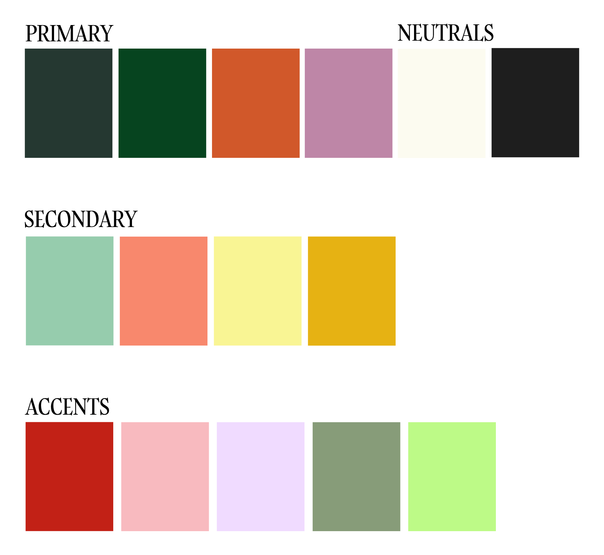
Colour Palette
This palette has a versatile range that lets us maintain cohesion while bringing variety. We’ll be able to use each category consistently across different materials, from digital content to print, with Primary colours setting the brand tone, Secondary colours adding balance and softness, and Accents for eye-catching details.
Primary Colours
Dark Forest Green, Deep Green, Warm Terracotta, Soft Mauve
Vibe: These colours are sophisticated, warm, and professional, perfect for establishing the core visual identity of The Courterie.
Secondary Colours
Soft Sage, Peachy Coral, Light Yellow, Golden Yellow
Vibe: The secondary palette introduces a gentle and approachable feel, balancing the strength of the primary colours.
Accent Colours
Scarlet Red, Light Coral Pink, Lavender, Sage Grey, Lime Green
Vibe: These colors bring versatility, brightness, and a bit of playfulness to the palette. They’re ideal for highlighting or adding small, memorable touches.


