
Brand Development & Design:
The Exchange | Legal Ops Podclub
Fresh Ideas.
Real Conversations.
Legal Innovation.
The Exchange is where legal ops innovators come to connect, learn, and spark fresh ideas. Through our podclub sessions, we turn podcasts and TED Talks into engaging conversations that inspire action and drive change in the legal sector.
For busy professionals in legal operations, tech, and project management, The Exchange offers a fresh, interactive way to learn and connect. Unlike traditional webinars or networking events, we combine curated podcasts, TED Talks, and spontaneous discussions in a virtual environment designed for innovation and connection.
Primary Logo
The primary logo for The Exchange – Legal Ops Podclub is a bold and modern visual identity that reflects the essence of connection, collaboration, and innovation in the legal operations community.
The overlapping squares and lines symbolise structure and interconnectedness, representing the diverse professionals and ideas that come together within The Exchange. The semi-circle within the composition reflects the idea of dialogue and exchange—key values of the podclub format, where conversations spark fresh perspectives. The strong, clean sans-serif font underscores the professionalism of the legal ops field, while its contemporary styling reflects The Exchange’s fresh approach to learning and networking.
Together, the design elements create a striking and versatile logo that embodies The Exchange’s mission: fostering meaningful connections, inspiring innovation, and reshaping the future of legal operations.
Core Values
Engagement Over Lecture: No passive webinars here—our podclub sessions are about active participation and real conversations.
Community First: The Exchange isn’t just about listening; it’s about connecting with peers who share your challenges and ambitions.
Accessible and Fun: Learning and networking shouldn’t feel like a chore. We make it engaging, spontaneous, and energising.

Secondary Logo
Brand Icon
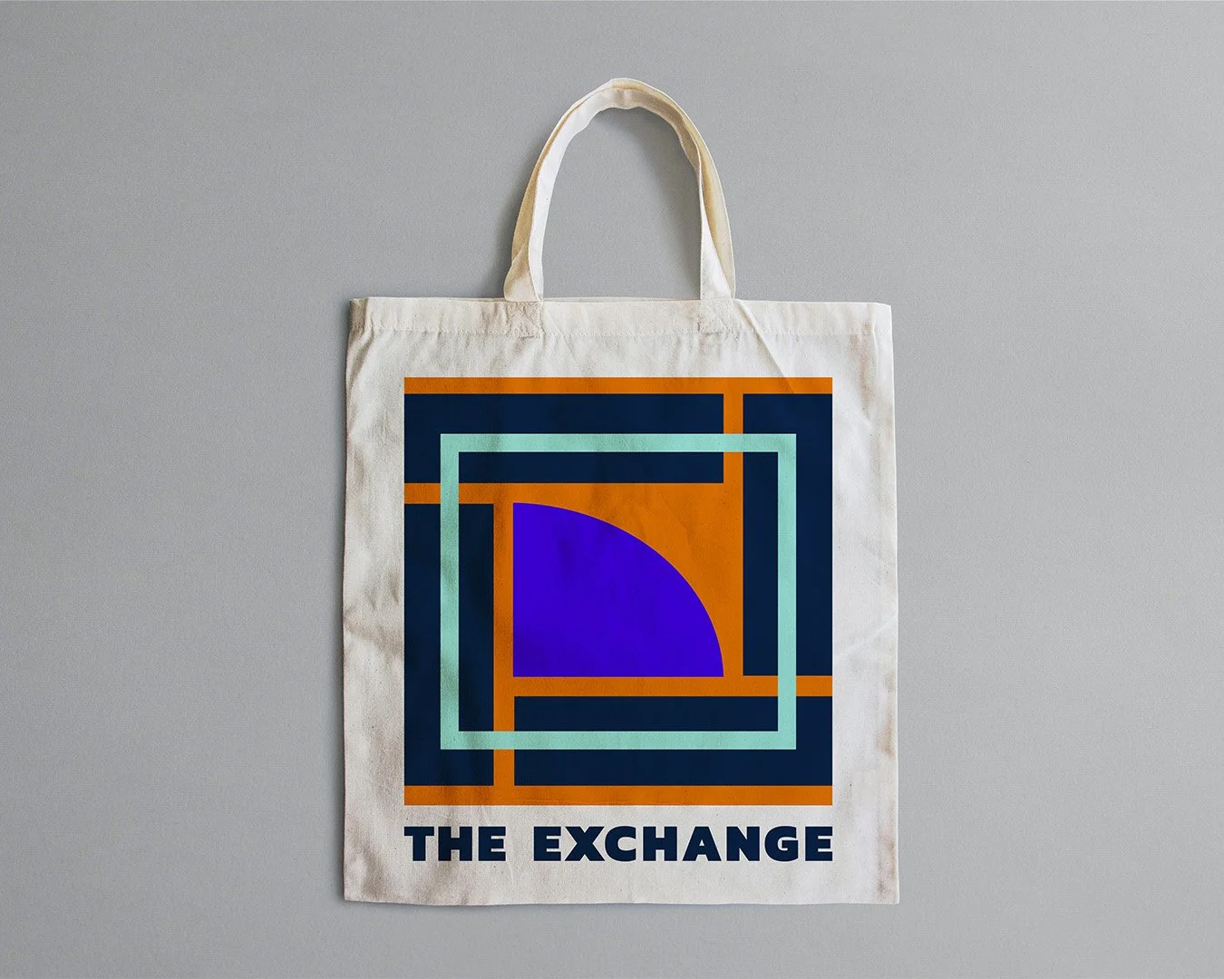
The icon for The Exchange – Legal Ops Podclub is a bold and modern representation of the brand’s core values: connection, innovation, and collaboration.
The layered squares and intersecting lines reflect the idea of structured networks and collaboration. These elements represent the legal ops professionals coming together to share ideas, solve challenges, and innovate.
The overlapping shapes create depth, symbolising the layers of insight and conversation fostered in every podclub session. The semi-circle within the design evokes a sense of dialogue and exchange. It represents the dynamic conversations sparked by each month’s podcast or TED Talk. The curved shape breaks the rigidity of the squares, adding energy and movement to the design.
This symbol encapsulates the mission of The Exchange: fostering a connected, forward-thinking community in the legal ops field.


Colour Palette
The Exchange’s colour palette reflects its core values of innovation, collaboration, and professionalism, combining bold and energising tones with balanced, approachable accents.
TE Navy: Professional, trustworthy, and authoritative. This grounding tone establishes The Exchange as a reliable and credible leader in the legal ops space.
TE Bright Blue: Bold, dynamic, and forward-thinking. Adds vibrancy and energy to the brand, symbolising innovation and thought leadership.
TE Turquoise: Refreshing, inviting, and approachable. This versatile hue introduces openness and creativity, encouraging inclusivity and collaboration.
TE Light Blue: Calm, airy, and modern. Provides a clean and spacious feel, allowing other colours to shine while maintaining a cohesive and approachable aesthetic.
TE Orange: Energetic, bold, and creative. Represents the spark of inspiration and the boldness to innovate—core to The Exchange’s mission.
TE Cream and White: Minimal, balanced, and sophisticated. The neutral tones softens the overall palette, providing a subtle backdrop that complements brighter colours.


